All science, when you come down to it, is mental models, and the overwhelming majority of human mental models are visual. It’s only a modest exaggeration to say that science is visualisation, and vice versa.
A human being finding itself in the dark will normally listen for sounds, explore adjacent surfaces and spatial relationships by fingertip touch, and cautiously move through the available space with the whole body surface tuned for input. But from the resulting data the mind will mentally synthesise a visual, not auditory or tactile, representation of its surroundings. Olfactory information will be interpreted in relation to, and amplify understanding of, the developing visual model. And a human being entering conceptual or intellectual spaces that are not directly perceivable extends this same behaviour: available information from whatever source is manipulated symbolically but, in most cases, modelled visually.
All scientific computing is, from one point of view, about making those mental models bigger or faster or more complex while keeping them meaningful to the human mind. And all of this is even more so for information that is crossing expertise boundaries within an ever more specialised knowledge universe, where experts from one line of work must often make use of concepts or results from another.
Within its emphasis on the visual, though, the mind is very flexible and adaptable. Interpreting colour as an indicator of olfactory type or intensity, for instance, presents no real problems, and models need not be literal or even consistent in order to be useful. An atom is not the raspberry with orbiting peas or blackcurrants portrayed to me in primary school. A molecule is neither the bundle of sticks shown by a 2D structure diagram nor the space filling foam of coloured bubbles in a geometry minimisation image. Yet all of these visualisations (together with visually descriptive terms like ‘ring’) are useful components of background understanding when interpreting symbolic chemical information. Though far less physically abstract, body imaging makes greater and more complex use of false colour. Where colour in the molecular model is usually a labelling device to distinguish one particle from another, in medicine it typically expresses variation across continuous measurement scales.
The ubiquity of computing has brought immeasurable benefits to every field of study, and to science in particular. It has also brought a need for everyone to be comfortable using it, regardless of aptitude or interest, which makes usability a primary concern and plurality of user interfacing essential. And since calculation is a fundamental requirement of modern science, linking it with visualisation is an obvious usability benefit.
Radionucleide therapy is one example of what has always been a tricky, but necessary balancing act in medicine: the use of harmful substances for therapeutic effect. The difference between safe dosage of digitalis for congestive heart failure and lethal dosage as a poison is, as these things go, fairly straightforward, but equivalent judgement for radioactive pharmaceuticals is a much more complex business. The distribution and redistribution patterns of progressively absorbed energy per unit mass must be tracked in
time and three dimensional space, through tissues which differentially interfere with observation.
At Lund University a team uses a visualisation system controlled and processed using IDL to develop a standardised dosimetry package, LundADose[1]. Multiple gamma radiation images (2D and tomographic 3D) are made in sequence, using a camera system which registers scintillae, and registered precisely to produce temporally longitudinal visualisations. Numerical techniques are then applied to model energy absorption over time.
Calculation is not just an output requirement, but an input essential too. The precise alignment of different images at volumetric pixel level necessary for useful analysis is handled by managed image transformations, again written in IDL. Compensation for, or correction of, the various physical interference effects also has to be made – attenuation according to tissue depth, for example.
IDL is a vector-oriented programming language, which makes it particularly suitable for image operations. Originally developed for space research, but since owned by, among others, Eastman Kodak, it is currently the property of ITT Visual Information Systems and used by a number of medical centres. As programming languages go, it is at the transparent end of the human readability scale where there is a significant level of correlation with natural language usage, which makes for accessibility enhanced by the provision of both GUI and command line use – advantages mentioned by two of the authors in a discussion of the project’s mechanics[2].
Levels of exposure and damage to human systems, tracked through complex distribution vectors, were also my own concern as I sought to make sense of a mass of accumulated environmental and medical data in a fraughtly sensitive pollution study. Manipulation of visualised forms was again part of the solution – but with the big difference that the Lund project team members are experts in the subject matter, and I am not.
As a freelance, frequently presented with several unfamiliar and heterogenous fields of study before breakfast, I am used to separating data from context. My concern is with the informational and analytic structures of the information itself; other people worry about their expression in discipline-specific terms. Sometimes, however, contextual knowledge is necessary in order to see those structures in the first place. In this case, the system I had to quantitatively analyse with a view to eventual modelling was an agricultural community subject to various acute and chronic pollution sources of very different types over generations. Heavy metals and biological pathogens are very different sources of trouble but are not, in practice, in hermetically separate operation spaces; nor is there always an intuitively obvious link between trigger and result. Between input and output lies a black box of processes that must be understood, at least in conceptual outline, before the data can be analysed meaningfully.
As a direct serendipitous result of preparation for this article, I was introduced to the visualisation components of ChemAxon’s Marvin Suite. Java-powered, with very intuitive hands-on controls instantly usable by a novice, these are available without charge for individual, evaluation and education, or academic use (check conditions for other contexts), which came in handy as I wrestled with expert briefings way beyond my chemistry comfort zone.
ChemAxon offers a whole package of tools for building chemical systems, including the JChem database system. Marvin relates to this by providing tools for drawing and viewing chemical structures and reactions with associated calculations. Views can be 2D or 3D and can be animated or manipulable with the mouse. One of the nice things about Marvin, compared to other similar tools familiar from integrated chemistry suites, is that it comes as either ‘beans’ or applets. The first, as their name suggests, are building blocks for applications so the functions of Marvin can be implanted within customised régimes. Applets make the same capacity available to web pages and part of my exploration was done through third-party sites offering Marvin as part of what they do, including the drug discovery site shown in an accompanying illustration.
ChemAxon's software in use as a component of the Bioscreening.org drug discovery database explorer. The background shows (left of screen) a view of six components in structure diagram form, overlaid with clips from the same page set to ball/stick and spacefill views. One compound has been opened (screen right) for closer examination and calculations including elemental composition at the bottom of the frame, with the source code shown at the right hand edge. At bottom left is a section from an animated MarvinSpace 3D visualisation of HIV Protease.
There are, however, also ready-made applications built from the Marvin Beans. The showpiece is MarvinSpace, a 3D molecular visualisation environment for a range of platforms, which also allows labelling and annotation. Subsidiary are MarvinSketch (a chemical editor), MarvinView (a viewer providing simpler facilities) and calculation plugins giving various information about the compounds modelled.
ChemAxon describes MarvinSpace as handling ‘small’ molecules; I don’t know what the size limit is, but neither I nor my patient mentor hit it. Using MarvinSketch to manipulate structure diagrams, the changes reflecting in 3D real time in MarvinSpace, confusing chains of biochemical reactions became manageable. With cheery commentary such as ‘if we clip this bit off the enzyme after the organophosphate binding and plug it into that protein, then split the nitrous oxides from the RDX...’ my mentor took me through a maze of decomposition and recombination processes covering decades and hundreds of compounds with only moderate pain.
This sort of rapid education, allowing someone with rudimentary knowledge to grasp complex relationships and concepts, is one of the big payoffs from the computerised visualisation revolution. Lund’s department of clinical sciences is seeking, in the long term, a packaged solution for radiotherapeutic dosimetry but, as a spin-off, provide images which encourage intuitive understanding for lay viewers of the imagery as well. ChemAxon displays enlightened self interest by making its tools freely available to a wide swathe of the scientific community (its own pages, and background research, show a Marvin user base from primary schools up to international pharma).
Two pollutants (lead tetraethyl and toluene) visualised in MarvinSpace
Looking more widely, VisiQuest is a glyph-based environment from Accusoft, with an image analysis toolbox at which I’ll be looking in greater detail in a future issue. Where the Lund story is one of specific application, and Marvin Suite exemplifies wide applicability within a specific discipline, the diversity of user applications for VisiQuest illustrates something of the wide range over which computed scientific visualisation is put to work.
An offshoot of the US National Oceanographic and Atmospheric Administration (NOAA), the Satellite Climate Research Group (SCRG), has developed VisiQuest toolboxes for analysis and visualisation of data environmental satellites in a programme of climate variability studies. Elsewhere, the software is used to develop tools such as automated ‘truthing’ (verifying by inspection the causes of variability) for long term research on ecosystem impact gradients. In a conceptual parallel to the Lund project, VisiQuest is also behind the assembly of paediatric study volumes from multiple ultrasound images of hydrocephalic infants in the womb: the cerebral ventricles are automatically detected within each scan, then collated and registered.
For something completely different, VisiQuest is also central to various military programmes from space-based radar (SBR) through integrated multisensor, polyspectral surveillance to automated target identification (ATI) or recognition (ATR). In reality, these projects are not separate in any real sense, but to consider them under the bureaucratic structures of teams and budget divisions makes life easier.
The multisensor usage is part of a DARPA (US Department of Defense Advanced Research Projects Agency) testbed project. VisiQuest’s rôle is to harness disparate software algorithms, from multiple suppliers and ranging from very old to not yet implemented, for purposes from spatial and structural analysis to detection of changes in objects, into a single environment that presents diverse data sources in a usable visualised form. 
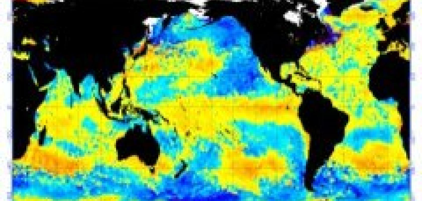
High-resolution ocean temperatures data visualisation from NOAA's long-term international satellite-based observations archive
SBR has many civil applications. Earth observing radars have, for example, produced much of the oceanographic and other environmental data mentioned above in relation to climatology, enabling current levels of elevation mapping and GIS modelling. Planetary radars on the Magellan and Cassini-Huygens explorations apply the same principles to close observation data on Venus and the Saturn system respectively. The engine behind the technological economics of such work, however, as so often, is military – specifically, since it accounts for half of the world’s budget in the US military. DARPA’s exact lines of research are not publicly spelled out, but civil capabilities are an obvious baseline and triangulations from outside or off-the-record sources give a general idea. Target location, identification, tracking and analysis, with increasing resolution from increasing orbital altitudes and greater numbers of satellites, are priorities. The result is an escalating visualisation complexity, which VisiQuest manages.
ATI has become an ever hotter area of military attention since its use in the first Gulf war. Truly autonomous weapon systems have become a frightening but real part of the immediate future, but weapons that depend on automated identification and tracking as components of target acquisition are already in use. One information source told me that in some unstructured battle spaces (examples might include microtargets in rural Somalia or Afghanistan) the final human decision to accept a target and release a weapon is already a rubber stamp which could, in technical if not sociopsychological terms, be removed – only ‘a need to at least appear casualty averse’ making it unacceptable. Automation depends heavily on visualisation technologies and methods (such as matching analysis of oriented edge pixels, and support vector machines with Gaussian kernels able to make bounded decisions around them) originally developed as targeting aids to human pilots, spotters or gunners.
As with multisensor systems, ATI presents a constant need to integrate and reuse older algorithms within rapidly developing structures that evolve in unexpected ways in the light of new research. This is where VisiQuest again serves as an integration environment, enabling accretions of discrete code to present as a coherent and usable body of visualisation methods.
Changing tack (and product) again, IDBS has a suite of science-directed ActivityBase packages, which include visualisation components. One screening application for the XE variant provides automated checking of experimental discovery setups for problems in a pharmaceuticals laboratory. This, too, is something at which I shall be looking more closely in the future.
The various examples here are at very different levels of complexity and sophistication, but not essentially dissimilar in general principle. All exemplify the transformation of visualisation by readily available computing power, allowing mental models to be objectified and externalised. Once the visual model has been moved out of inner individual mental space to digital storage, it becomes not only durable and repeatable but a common artefact open to plural interrogation, criticism, analysis, review. In this respect, computer visualisation has, over the past couple of decades, facilitated a major new step on the journey of science towards realisation of its ideal. The visualised model has always been the central, if sometimes under recognised, philosophical core of science but was always vulnerable to the uncertainties and failings of both the flesh and the personality which contained it; its computer embodiment is less vulnerable to those vicissitudes and more conducive to collective scientific literacy.