Historically, knowledge and skills start in the hands of an elite few and gradually disperse outward through the population at large. There was a time when the process took centuries or millennia to unfold; nowadays it usually occurs in only years. Multiplication and division, for long stretches of relatively recent history, were university graduate skills and the computation of square roots only for the cognoscenti. The rate of progress is technology dependent and socially directed. Writing, printing, tables of logarithms, mass education in industrialised societies, the slide rule, the electronic pocket calculator, have moved the calculation of a square root from a difficult accomplishment through to a trivial black box action by anyone who can press a key. The spreadsheet, at the cost of a few additional key presses and a little extra understanding, applied to that same black box to potentially infinite data ranges.
What has all this to do with an overview of data analysis in 2007? Bear with me a while.
That example of a square root is not chosen lightly: the conceptual acceptance of a square root as a world view component is a marker in the specific strand of cognitive development upon which a statistical view of data depends. This is true, whether one can compute it or not, but internalising acceptance of something which one cannot do or use is difficult.
The movement is not only downward. Methods that allow black box handling of complex ideas and techniques also allow those at the leading developmental edge to collapse time-consuming tasks into automated tools that either directly facilitate the growth of higher level methods – or at least clear the decks and free up resources for their pursuit.
Sophisticated data analysis has, for some time, been moving away from statisticians into wider domains: first to become a routine tool of all scientists, then to widespread use in business, and finally a black box tool for general use. Although the foundations lie in agriculture and operational research predating electronics, the technology which has driven this and decided its pace is of course the spread of increasing computing power at falling cost.
The emphasis in software development for this growing market has, by and large, been on segmentation. There are always exceptions, but as an overall generalisation, products were designed for and marketed to the perceptions and needs of a particular user base. Genstat, Statistica and S-Plus, all of which have recently released upgrades, were (to a greater or lesser extent) aimed at the hard-core professional user and had underpinning command languages. Some packages concentrated on particular market areas: Minitab, for example, with its strong foothold in education and its penetration of the six sigma community. The less demanding (in statistical terms) called upon less powerful but easier to learn and use GUI-driven packages, or used spreadsheets with or without specialist add-ins. Specialised markets had tight, fast, dedicated tools like Biosoft’s QuantiScan. Technical graphics software had descriptors and some basic analytic capability, but only as an extension of visual work for which purchase of a dedicated statistical analysis package was not justified. Computer algebra systems and generic programming languages included data analytic functions, but these tended to be called upon by a separate clientele whose needs were either particularly specialised or an offshoot of other mathematical activity.
Erosion of those boundaries has been going on for a long time, of course. GUI front ends made the top-end heavyweights far more accessible to the casual user, and at the same time made exploratory approaches more productive for their traditional adherents. At the same time, graphic visualisation was made both richer and more intuitive. From the other direction, technical graphics products like Origin progressively beefed up their analysis options. Other products blossomed to fill the gaps between, or cater for more specialised needs – the likes of Dadisp or Flexpro on the one hand, Tablecurve3D or Peakfit on the other. But this year seems to be on a point of flexion in the curve, where a gradual change shifts up a gear significantly, transfering analytic tools outward on a large scale from the professional core towards general social utility. It may well be that 2007 is seen as the year when a tectonic analytic software market shift began.
One straw in the wind is OriginPro. This publication tool for technical graphics has long been making moves along the usability and analytic power axes. Release 8 (in beta at the time of writing, but due at market somewhere around the same time that this issue of Scientific Computing World appears), however, significantly pushes up the rate of change for both.
Another is the release of Mathematica 6, which marks a dramatic shift of Wolfram’s attention towards the mass market in several ways, most obviously curated data and the demonstrations project. The demonstrations project, with a large payload of accessible applications, has teachers using Mathematica models in primary school (see Scientific Computing World’s new education website, www.scientific-computing.com/education). Curated data is more directly relevant to my theme of a push to simultaneously colonise the data analysis market and place use of data analysis tools in a widening range of hands.
The general trend towards more ‘newbie friendly’ interfaces and software agents, assistants or wizards underlines and strengthens this shift. Maple 11’s assistants, both for analysing data and getting it into Maple in the first place, open up usability to whole swathes of people who would never have dreamed of looking at previous releases. Those assistants only make sense within the larger strategy which Maplesoft has explicitly and energetically pursued to make its product progressively more transparent and intuitive in every way. Maple, according to conversations I’ve had with people inside Maplesoft, is also looking towards further strong development of data oriented facilities at both high and low ends of the user spectrum, from handling to acausal modelling.
Maple's data analysis assistants are within a radical development of the product's whole interface towards a wider user base.
A couple of years ago[1] I argued that access to powerful software for mathematics facilitates the same sort of democratising impetus that (for example) the likes of home video editing software provides for visual representation and DTP or web editors for publication. It is, or rather could be, the next step beyond the pocket calculator. The benefits of such a move are not just for the empowered individuals; the historical drift of knowledge from specialist to population has, in the long run, almost always been advantageous for society as a whole.
A technological society depends upon a sufficient pool of recruits for scientific work, and markets able to employ the results. High levels of literacy and numeracy are a prerequisite for both (for which the bar is always rising) and the meaning of both terms becomes increasingly sophisticated. There is no socialist altruism involved in the suggestion that scientific computing should look to the compost from which it ultimately draws sustenance: it must become more inclusive or wither.
But pure mathematics has other barriers besides its manipulative difficulty, and one of those is the gulf to be bridged between its abstraction and concrete experience. Data analysis, by contrast, while it can be just as abstruse and impenetrable, is firmly rooted in mental models of the day-to-day world which make immediate sense to the lay person and, equally important, from which a clear ladder of conceptual steps can be followed to less obvious aspects. This is a natural first foot in the door to more widespread acceptance of scientific computing as a general tool.
For Wolfram, the double-pronged move towards a new market sector and a new market layer makes sense. The traditional data analysis buyers are already either well catered-for by specialist data analysis software suppliers or already within the computer algebra fold. The new curated data bypasses many issues of data source location and access, data import, format harmonisation, field selection, consistent handling and so on, all of which may be simple enough for a regular user but nightmarishly off-putting for a new, occasional or casual visitor. Even hard-core data consumers could often operate more efficiently (and get up to speed more quickly in the early days) using preconstructed conduits and artefacts rather than learning to drive the means to construct their own.
For OriginPro, already within an environment firmly based in common experience and visual analogues, the logic is equally clear. I have many students who are headed for science careers, and are not lacking in intellectual reach, but whose statistical requirements are confined to a small clutch of well-understood tests and techniques: they have no need for ever more powerful methods, and certainly not for algebraic programming. Then there are many friends who would never think of themselves as scientists, but come to me for help in dealing with an ever greater flood of data from which they must extract usable decisions. Both of these groups are already comfortable with graphic representations of data; the addition of analytic tools within their operating range would make perfect ‘one-stop shop’ sense.
Looking at other application types that have made a similar market shift, the logic of this should eventually see data analysis arriving as a component in the standard desktop office suite. In some ways, that has already happened with spreadsheets offering graphics and some analysis, which will probably slow things down a bit but doesn’t really address the issue. As a data container the spreadsheet works well enough, so the desktop office suite analysis component of the future will probably rely on it for that purpose. Analysis in a spreadsheet, however, even if of adequate quality, is a cumbersome business and needs to be replaced.
There are many data analysis add-ins available, especially for Excel; perhaps the standard office suite components will come from that direction. There are also fully-fledged applications which will either operate as free-standing solutions or disguise themselves within other applications – Unistat is an outstanding example of this type, available as a ‘Light Edition’, which would go very nicely into an office suite with the full unlimited version as a ready-made upgrade path. Or maybe the big players will decide to bid for the slot. All of the established statistical software companies have been busily making their internal worksheets look and work as much like Excel as possible, and most will now directly open an Excel sheet in place of their own. Statistica has, perhaps, the best established graphically-friendly interface in the traditional market. S-Plus is one of many packages to have a history of Excel link experience – as is Mathematica. Genstat has a high-end following to satisfy but has, for several years, been building up its GUI alternative and may have more room for manoeuvre.
Perhaps, though, what is really needed is a completely new interface approach. GUIs are friendlier than command lines or spreadsheets to the new mathphobic data consumer, but all of those currently offered are sugar coatings rather than inherently palatable delights. An example of what can be done in the way of rethinking the whole approach can be seen in InspireData, a program designed for school use.
InspireData is published by Inspiration Software, better known for two mind mapping products (an adult one, Inspiration, and an early-years Kidspiration version) and bringing the same visual interaction principles to data analysis. I’m sure you’re thinking that school software has nothing to say to adult scientists, but the results of a quick survey over the past couple of weeks suggests otherwise. I nagged just over a hundred people into looking at InspireData, using a data set derived from a university metals content analysis study. Roughly a quarter of my guinea pigs were graduate nonscientists (administrators, historians, librarians, social workers, policy makers, etc). The rest were all involved in some way with a hard science and had at least a bachelor’s degree (some graduate research students, department heads, professors, lab technicians, a sprinkling of mathematicians and physicists, some chemists and a molecular biologist... you get the idea). All of the first group, and all but half a dozen of the scientists, were delighted with the interface and said that they would welcome it for either themselves, their undergraduate students, or other members of their team.
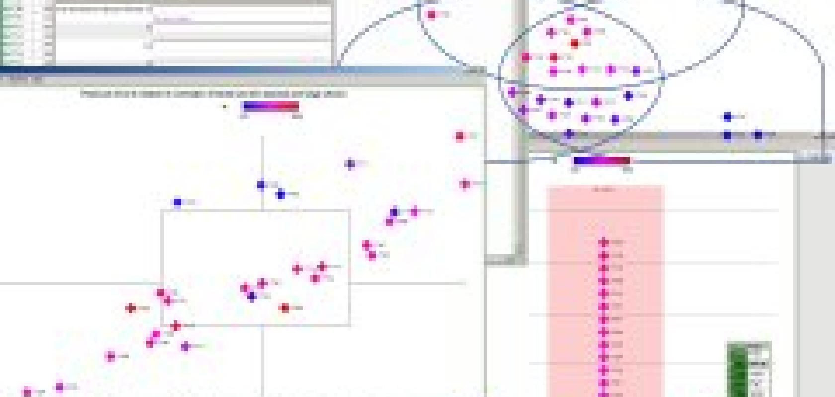
InspireData has its own worksheet, and will import only CSV or TSV text files, but it accepts copy and paste from any grid-oriented display (spreadsheets, HTML or word processor tables) – as do most statistics software products nowadays. There are two views: table and plot. In plot, data are represented by markers that are initially scattered about the desktop. If a plot type is selected, setting it up is a matter of a few clicks (select variables, ranges, and so on) after which the markers move quickly, but not too quickly for the movement to be understood, from their random positions to correct positions in a plot. The plot can be a Venn diagram – in my example screen shot on p12, markers have moved into sets representing critical levels for metals of interest. For a histogram or bar chart, the markers stack themselves up; for a scatter plot they move again to align themselves at the appropriate coordinates within the display. Markers can optionally be labelled and coloured using any fields. Hover the mouse over a marker and the data for that case are displayed on screen as a table alongside.
A montage of views from the InspireData interface. From top left clockwise: the work sheet (overlaid by data entry form), the Venn diagram, stacked data chart (with one data point opened for detailed examination, bottom left box), and scatter plot with range/median plot.
InspireData, as a package, is tailored to its intended audience, which are young school students probably in the seven-to-15 age bracket, and so the actual statistical tools behind the interface are not in the same league as ‘proper’ analytic software for professional scientists. But that’s not the point. The ideas and principles embodied in the interface could be adapted and applied to any heavier weight package. The people among whom data analysis software will be seeking new user-bases will, by definition, be learners: software that recognises this fact will have a greater chance of sucking them into using the available tools than one which scares them. If I were a statistical software publisher at any level, hungry for new markets among those millions of computer users yet to use serious analytical software of any kind (or, worse still, bruised by the attempt), I would be beating a path to Inspiration’s door, cheque book in hand.
Imagine the impact on mass scientific data literacy, and the advantages for upflow, that might accrue from a mass-market package as common on every desktop as the word processor, with analytical methods harnessed behind a visual learning interface that primary school children handle with confidence.
References
1. Grant, F., Scientific Computing World, 'Count me in: maths for the wider public'. Cambridge 2004 (September/October), Europa Science. Available from: www.scientific-computing.com/scwsepoct04maths.html.
