In the last issue, talking about the statistical work conducted by non-statisticians, I mentioned the importance in that context of graphical visualisation of data. It goes well beyond that, however.
On the one hand, fuelled by the ever-accelerating growth curve in computing power per unit of investment, visualisation has progressively moved to the core of exploratory and analytic strategies. The effects on traditional methods are profound, as separate work phases collapse into continuous cybernetic feedback loops and statisticians develop increasingly immersive relationships with their raw material. On the other, data visualisation has penetrated mainstream discourse to become an integral part of vernacular literacy – ‘one of the genuinely new cultural forms enabled by computing’ as Lev Manovich[1,2] describes it.
Those two aspects, the technical and the vernacular, are not separate; they are two sides of the same coin. They are beginning to interpenetrate with other developments such as direct onscreen haptic manipulation of program interfaces and may in the long run turn out to be the most far reaching and profound effect of the scientific computing revolution.
At the heart of this lies the capacity of inexpensive desktop, laptop or even handheld devices to manipulate graphics in real-time response to user curiosity. When I started writing for Scientific Computing World, back in the 1990s, it was possible to represent three data variables as a scatter plot cloud, or as a fitted surface, on x, y and z axes, but changing the viewpoint or scale usually involved typing new parameters into a settings box and watching the screen progressively redraw. It seemed pretty cool, then. I remember my excitement when the major statistics packages, one by one, added the ability to grab the plot with a mouse click and intuitively apply zoom, pitch, roll and yaw by dragging. Nowadays, I can do the same on a pocket tablet or even a mobile phone by simply sliding my fingers around the image itself. On a desktop, laptop or heavier tablet I have access to considerably more than three dimensions, not to mention different display types such as vector flows in the same visualisation as positional points, planes or volumes.
Not that such impressive psycho-perceptual pyrotechnics are always necessary or even desirable in every context. Detailed 2D presentation of very traditional plots of the kind that would have been familiar to my primary school self in the late 1950s are, in many circumstances, still the best visualisations of real world situations. The miracle of current software is that those two extremes, and everything between, are available off the shelf to suit the needs of the moment.
Well known software implementations of traditional plotting include (in alphabetic order) Grace, Origin Pro and SigmaPlot, each of which takes a different approach valued by different users, but there are numerous other examples in what may be the most densely populated niches in the data analytic ecology.
This proliferation reflects both the importance of such visual plotting and the different priorities brought to its practice by scientists. SDAR, for example, is a new addition in the last couple of years to Griffith University’s platform independent Program Collection for Structural Biology and Biophysical Chemistry (PCSB) of Java applications. That institutions such as Griffiths feel it worth investing in new tools rather than automatically taking the easier and cheaper option of buying in well-proven existing ones says much about how vital this area is to mainstream work.
Whether plotting one time series variable or juggling seven in concert, graphic visualisation of data builds on the remarkable adaptability of our own human system software. Originally evolved to aid survival in an arboreal predator/prey habitat, this has so far proved itself up to the task of embracing every environment our species has encountered – including abstract data spaces with no objective reality. Every time I cross a busy road, usually on autopilot whilst thinking about something else, I intuitively and subconsciously process an extraordinary quantity and variety of rapidly changing data relations to reach viable solutions of complex equation systems in fractions of a second. To do this consciously would take much longer, and render the crossing of roads impossible; and so it is with less concrete analyses. Intuitive grasp doesn’t, by itself, solve scientific problems; it is, however, the key to isolating potentially fruitful pathways through unmanageably dense data traffic for more rigorous investigation. And, because human beings have evolved with vision as their primary sense, visualisation offers a greater data input density to that intuitive processor than any single conduit.
As with simpler one or two variable plotting, there are many software tools whose purpose in life is to harness this innate processing potential as efficiently as possible. Most of the big statistics packages, as I have already mentioned, offer very good facilities in this area alongside more formal analysis of the promising prospects which they reveal. That kind of multidimensional data space navigation is very conveniently illustrated, though, by the product line of Golden Software which gathers in one place a single range of tools covering a spectrum of visualisation activities. At one end is Didger, which handles tasks from digitising paper maps to harmonising datasets with different coordinate systems. At the other lies Voxler, a 3D solid visualisation package managing the translation of data to volumetric display pixels (voxels). Between the two limits come Grapher (an occupant of the 2D and 3D graphing market), MapViewer (a thematic map generation and spatial analysis tool), Strater (boreholes, wells, geostrata) and Surfer (3D surface mapping and contouring).
Golden Software has its origins in mining, and the most usually described applications for its products are geophysical with a subterranean bias (see, for example, box ‘The show so far: rubbish’ for combined use of both Surfer and Voxler), but their fetch is much greater. One use for Voxler which reaches upwards instead of downwards is atmospheric modelling: plotting air temperature data over a particular region and then interpolating to visually explore thermal variation over a range of altitudes or geopotentials, for example. The potential goes way beyond such physical spaces, though all those inbuilt human instincts work as well with metaphorical constructs as with literal ones. My first experience of Surfer on real research was with two students who used it to model social attitude data; with Voxler, an analysis of military interactions where time replaced the physical x axis, red and blue faction audits the y and z.
Software combinations are widespread and are not limited to single publisher pairings.
A study of the role played by the Caucasus in shaping human migrations[3] deploys a combination of spatial density maps from Surfer in combination with graphic elements generated by other software. Network trees, interrelation matrices, flow generators, and principal component plots join population structure distance spectra and geospatial scatterplots of linguistic and haplogroup markers.
The other face of graphical visualisation of data from analytic access is using the same inherent human navigational software to communicate complex information derived from huge data sets quickly, succinctly and meaningfully to others. Such communication lacks the precision of symbolic form, but offers an immediacy and comprehensive gestalt grasp which serial specification can never achieve. It also provides the best way to publish information beyond the immediate expert bubble. A nine-year-old is as able to comprehend the interplay of size and colour of vector arrows on a map of the Atlantic Ocean as a seasoned climate scientist. In a time when public understanding of scientific issues is of increasingly crucial policy importance, that matters a great deal.
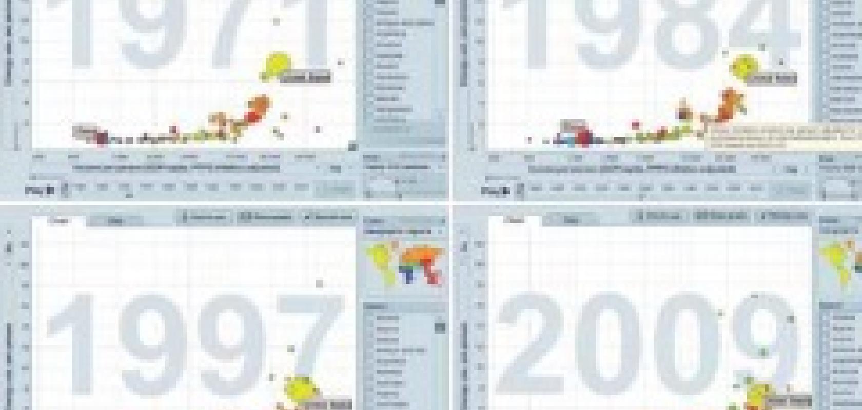
An expanding field of such mass data communication goes under the name of ‘infographics’. This is an umbrella term covering everything from illustration of a single fact (‘the paper used in this photocopier last year would stretch from here to Istanbul’) to changing multidimensional relationships (‘drag the pointer to see how HIV infection rate loci shift over time’). Well known examples are the Gapminder Foundation (which draws data from a variety of sources and provides links back to them), The Guardian (which provides its own raw CSV versions of the data sets behind the graphics), and Google Public Data (which allows upload of users’ own data sets for visualisation; the experimental Fusion Tables is another, related, user data resource) but there are numerous others and the choice is increasing all the time.
To dismiss these as froth, as some do, is a mistake; quite apart from increasing the sophistication and depth of public debate, they supply a growing number of scientists with initial seed corn entry points to potentially profitable research pathways. One recently funded medical study, for instance, originated in chance cross comparison between infographics from Visual.ly, We Feel Fine, Guardian Data and IBM’s Many Eyes.
Trying to see the future is a dangerous game, particularly in such a fast moving field as scientific computing. Nevertheless, it seems unlikely that the impact of these interlocked spirals of computer visual communication, specialist and general, is going to abate. In fact, I’d hazard a prediction that they will accelerate over the next few cycles of hardware development. Seen from the future, it may well be viewed as a defining aspect of data analysis in this decade.
For a full list of references and sources, visit www.scientific-computing.com/features/referencesaug13.php
The show so far – rubbish!
Rainer Albert is one of the experts contributing to the modelling of the Kölliken hazardous waste landfill site in Switzerland, combining 3D visualisations from both Surfer and Voxler.
The site contains almost half a million tonnes of organic and inorganic wastes from industry, commerce and the public sectors, deposited over a seven year period. Restoration started in 1985 and the site is currently being excavated and remediated under a large building (the Swalba and House Matter Hall) and is scheduled for completion by 2016.
Albert uses Surfer to display the topography of the site, along with 3D rendered buildings. Waste type and waste concentration from data collected between the surface and bottom layers (up to 17 metres apart) are displayed in Voxler. The transparent surface layer is overlaid with contour lines to display the landfill terrain, while displaying the chemical types and concentrations below.
Peering into the depths
Dr John Hall, a marine geophysicist, has research interests including global tectonics, offshore geophysical surveys, and compilations of detailed gridded topography. Much of Hall’s career was with the Geological Survey of Israel and in the early days he had to work within a prohibition on digitisation of map contours.
Using early Surfer software (then running under MS DOS on an IBM PC AT computer and working on ‘piddling little grids with maybe 100 by 100 nodes and 1,000 data points’) he evolved an innovative method of generating a grid for Israel at a 25-metre resolution by the transcription of 1:50,000 topographical sheets.
Incomparably more powerful current incarnations of Surfer can compile and krige thousands of digitised soundings. Using these, Hall has created digital terrain models of the Mediterranean, Black Sea, Red Sea, Caspian Sea and a 50,000 square kilometre area near the north pole. In his contribution to the General Bathymetric Chart of the Oceans (GEBCO) Cook Book, he details his use of such software. Recent work includes kriging of 46,000 digitised soundings and other data to produce a grid of the Gulf of Suez for work at the University of California, Santa Cruz, to explore possible seiche standing wave explanations for Moses’ crossing of the Red Sea.
