
The field of laboratory data visualisation has evolved substantially in recent years. With the advent of sophisticated software and hardware tools, researchers can create interactive 3D visualisations, animated graphics, and immersive virtual reality experiences to explore their data. These innovations offer exciting possibilities for scientific exploration and education.
Laboratory data visualisation bridges the intricate data generated in scientific experiments and scientists' ability to comprehend patterns, trends, and relationships. This crucial interface has evolved into a powerful tool that enhances researchers' ability to communicate, analyse, and make informed decisions based on their findings.
Laboratory data is rich in information, but these insights might remain buried in spreadsheets or databases. Data visualisation tools, such as charts, graphs, heatmaps, and scatter plots, are powerful instruments for revealing these concealed gems.
In the laboratory, sound decision-making is often contingent on real-time information. Scientists must assess data rapidly to make informed choices, whether it's adjusting experimental parameters, troubleshooting equipment, or reevaluating research hypotheses. Laboratory data visualisation equips researchers with the ability to make data-driven decisions swiftly.
The integration of machine learning and artificial intelligence algorithms has enabled the automation of data visualisation, allowing researchers to uncover patterns and trends in vast datasets more efficiently. This synergy of expertise and computational power promises to accelerate how laboratory data is visualised and understood.
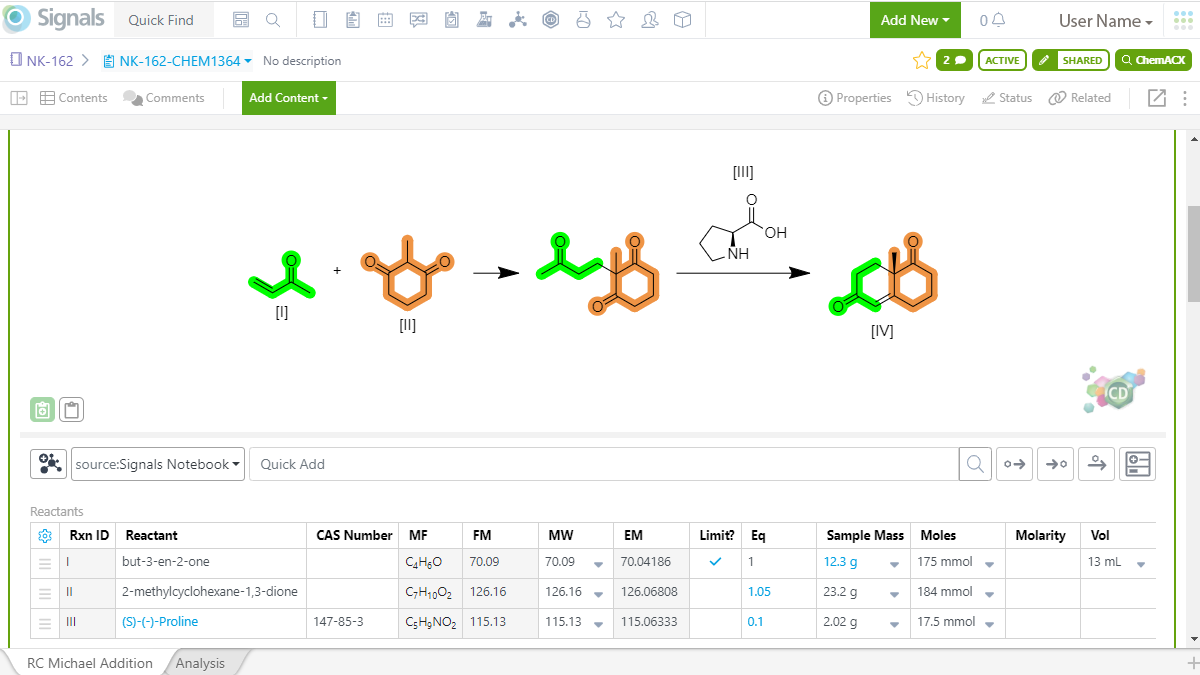
Featured product: Revvity Signals Software - Signals Notebook
Signals Notebook from Revvity Signals Software
Boost scientific productivity and creativity with Signals Notebook, the secure cloud-native electronic lab notebook (ELN) for chemistry, biology, and formulations. From increased collaboration to securely accessible data, Signals Notebooks accelerates Research and development.
Built on more than 20 years of knowledge, Signals Notebook is a modern cloud ELN that offers a powerful solution for all your scientific research data management needs.
Work intuitively in an easy-to-use ELN:
- Capture, organise and manage your data in a modern, user-friendly interface
- Access data anytime, anywhere, from a secure cloud application
- Search millions of experiments across many projects quickly and efficiently
- Openly and securely collaborate across departments with granular role-based access control
How new software aids data management and improves workflow
PROTACs, Molecular Glues and more
Laboratory visualisation tools on the market now:
Cytoscape is an open-source software platform for visualising molecular interaction networks and biological pathways and integrating these networks with annotations, gene expression profiles and other state data. Although Cytoscape was originally designed for biological research, now it is a general platform for complex network analysis and visualisation.
Cytoscape core distribution provides a basic set of features for data integration, analysis, and visualisation. Additional features are available as Apps (formerly called Plugins). Apps are available for network and molecular profiling analyses, new layouts, additional file format support, scripting, and connection with databases. They may be developed by anyone using the Cytoscape open API based on Java technology and App community development is encouraged. Most of the Apps are freely available from Cytoscape App Store.
Achiever Medical LIMS Analytics and Data Visualisation from Interactive Software helps users uncover the hidden benefits and insight in their lab data using Achiever Medical LIMS data analytics and visualisation tools. Leverage data to inform decision-making, recognise trends, identify bottlenecks, and highlight non-conformance.
This software enables scientists to analyse their data to understand what’s behind the numbers and create instant analytics through the Dashboard Designer’s simple user interface. Achiever Medical LIMS harnesses the power of the industry standard DevExpress Dashboard Designer to deliver business intelligence and data analytics that aism to provide insight into a lab’s performance and productivity. Helping users to make more informed decisions and providing early notification of potential issues.
StarlimsAdvanced Analytics for LIMS helps users visualise laboratory data. The Advanced Analytics solution allows scientists to view and analyse all the lab data stored in Starlims software so users can make critical business decisions. Quickly answer questions for root cause analysis, identify bottlenecks causing performance issues and opportunities for improvement, and help build a business case for new resources. Visualisations help lab managers proactively act on facts, apply remediation plans, and see the results of their actions, resulting in a more efficient organisation.
Visualise lab data in a way that makes sense. View data by geographical maps, colour-coded lab floor maps, or other layouts to quickly connect with scientists data and gain new understanding. View data from anywhere, on any device, including smartphones and tablets. The STARLIMS Content Library offers responsive Advanced Analytics dashboards which enable users to make immediate decisions even when they are out of the office.
SampleManager LIMS by Thermo Scientific provides real-time data visualisation and analytics to unlock hidden value in scientific data. The Data Analytics Solution for Thermo Scientific SampleManager LIMS provides authorised users with out-of-the-box dashboards displaying key business and laboratory insights. Resource availability, stock information, location status and lab performance are displayed in a clear, interactive format, with current status information and the ability to drill down for further detail and results.
The profiling element of the Data Analytics solution determines the most impactful variables to optimise prediction accuracy. The system uses the results of previous tests applied to similar samples as inputs, creating a machine-learning pipeline with predictive power. The data visualisation capabilities in SampleManager LIMS enable the user to configure dashboards and overviews, which can be made available to specific groups or users either on log-in or on demand as needed.
LabVantage Analytics gives users full control to explore, analyse, and visualise lab, enterprise, and even external data to gain valuable insights. Based on the Elastic Stack open-source search platform, LabVantage Analytics uses business intelligence with machine learning/artificial intelligence capabilities to track and trend KPIs and predict and alert on issues before they happen.
The Laboratory Performance Optimizer solution leverages artificial intelligence on disparate data sets to optimise processes and provide a 360-degree view of the lab. This provides meaningful insights from data for smart decision-making.
Clinical labs benefit from a model-informed drug development (MIDD) process. The Clinical Pharmacology Modeling (CPM) solution seamlessly integrates with LabVantage LIMS to provide high-throughput, template-driven utilities, enabling scientists to accelerate analysis turnaround times, ensure analysis consistency, increase computational efficiency, and reduce overall time and cost in bringing drugs to market.
Visualize – Laboratory Data Management Software, developed by Scigilian aims to Consolidate biological assay results with molecular entity information, enabling queries whose results create knowledge that informs drug discovery decisions.
Visualize is a laboratory data management software that accelerates the drug discovery and research cycle by eliminating the need to collate results from different sources manually. Visualize ensures complete capture of assay conditions so that users don’t waste time identifying the cause of unexpected results. Samples tested multiple times are automatically summarised using the most appropriate method and swiftly tracked back to the assay conditions for a given assay result.
Users can define how results are summarised and presented, focusing only on what’s important and eliminating visual noise and redundancy. This leads to better Informed research decisions, as users can quickly see the relationship between molecule structure, assay results, and the effect on the biological target.
The Highcharts library comes with all the tools you need to create reliable and secure data visualisations. Built on JavaScript and TypeScript, all its charting libraries work with any back-end database or server stack. The company offer wrappers for the most popular programming languages (.Net, PHP, Python, R, Java) as well as iOS and Android, and frameworks like Angular, Vue, and React.
Highcharts, the core library product suite is a pure JavaScript charting library based on SVG that makes it easy for developers to create responsive, interactive and accessible charts. Our library includes all the standard chart types and more. From area to x-range, we've got you covered. Our simple options-structure allows for deep customisation, and styling can be done via JavaScript or CSS.
